This is another post in the continuing series that describes the Design Suite Process. Please click on "Design Suite Process" in the list to the right to see the previous posts.
When we last left Naomi and Mike, they were deciding on their final design after receiving some alternate versions of the original concepts.
They quickly settled on Design #1 and asked for some possible minute changes. Mike, being an english teacher, was concerned about their names not being capitalized. We also played with the wording some more. I could show you all of these incarnations, but frankly, they aren't very interesting unless they are your invitations. And, for the most part they all looked quite the same, except for the Capitalization experiment, which truly did alter the look of the invite.
After some discussion on the lower case version being better suited to the design, Naomi and Mike settled on doing it that way. I then set about designing the other components of their invitations - the rsvp card ( a postcard in this case) the reception card, the directions card, accomodations card, and finally a "More Fun" card that listed the rehearsal dinner and gift opening. To save on mailing costs, Naomi and Mike will be including that card in the invites going to those invited to those events. You aren't seeing that process because 9 times out of 10, once the main invite is decided on, I design these other pieces and they are usually spot on right away since they follow the main design. Once we had all of these other pieces ironed out and they met everyone's approval (triple proof-read on both ends), Naomi printed them out, signed them with an "Ok to print" written at the top and mailed in the proofs to me.
While I waited for snail mail to deliver the proofs, I ordered all of their paper (a beautiful off-white stock with a rich thickness), created the printing plates (an explanation of their printing process is below), cut the paper to size and ordered the ribbon. One of Naomi's main colors in the weddings is the ribbon color, it is a Midori Double Faced Satin ribbon called "Almond Blossom", available at Romantic Flowers. I also ordered the custom die-cut stickers to be made.
Once everything was ready and proofs were in hand, I got to printing. And here, dear readers are the lovely results:
(identifying information has been doctored in Photoshop)
The whole set: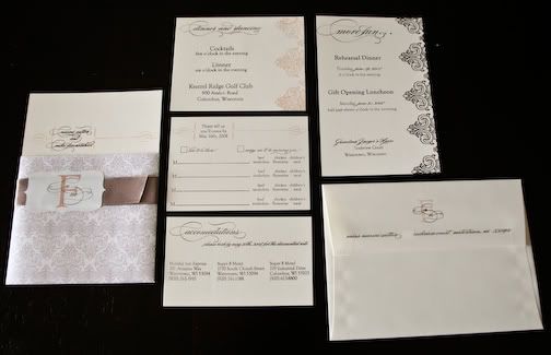
All of the cards to the right of the main invite in this picture got stacked behind the main invite and inside of the vellum sleeve.
All items stacked and ready to be put in the envelope: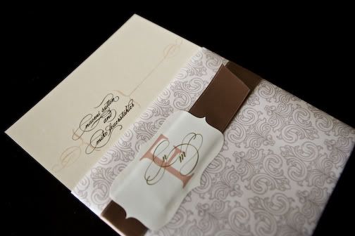
The Main Invite: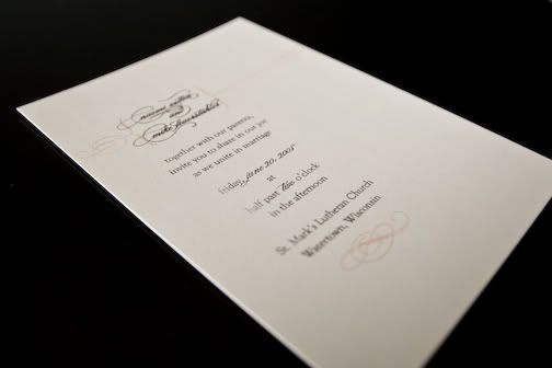
The Reception Card: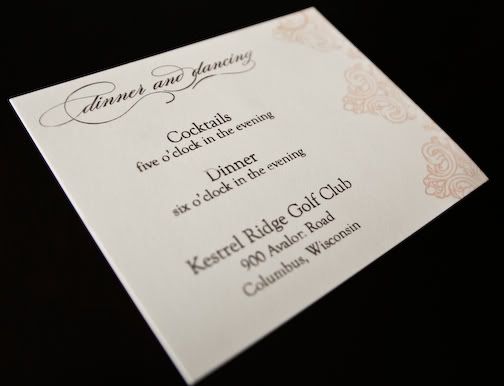
Directions are on the back: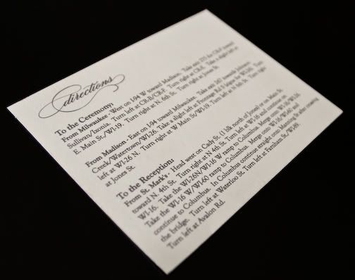
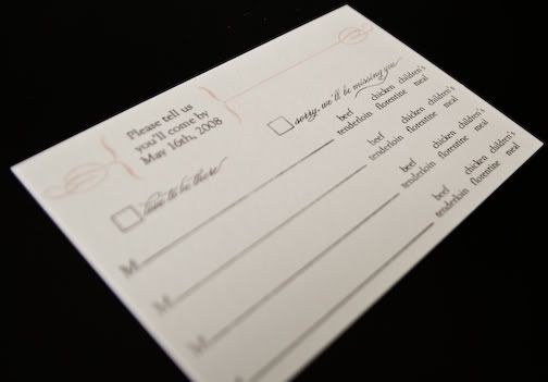
RSVP card: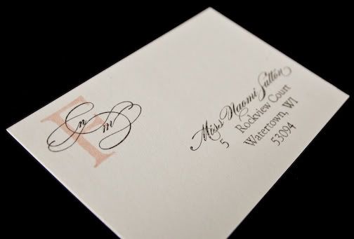
Accommodations card: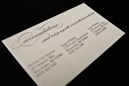
The "More Fun" card: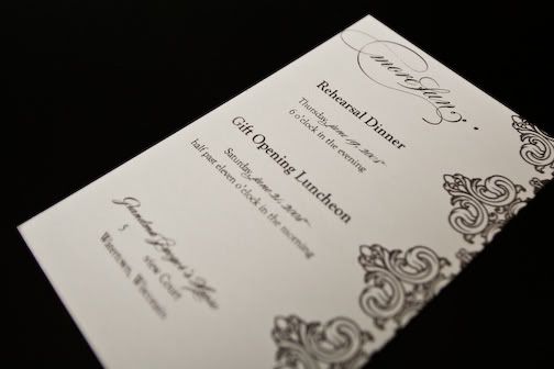
The pretty envelopes: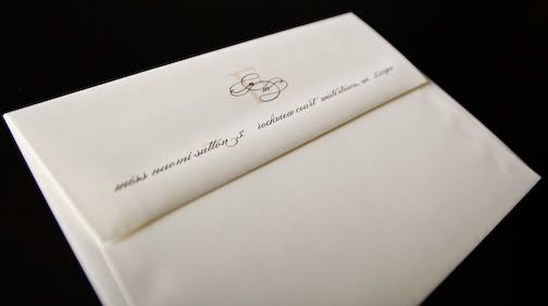
These invites were serigraphy printed, a process not unlike the way your t-shirts are printed. The result is a flat ink, not raised (like engraving or thermography) or indented (like letterpress), but with more hand-made hallmark than offset. You can see in some of these photos the variations that can result in ink coverage and opacity, lending the pieces a beautiful hand-made look.
Let me know what you think of the final results, and stay tuned in the coming weeks as we design the rest of their Suite (programs, placecards, etc).
Thursday, April 17, 2008
Design Suite Process - Part 3
Posted by
Molly
at
10:47 AM
![]()
Labels: Design Suite Process
Subscribe to:
Post Comments (Atom)
5 comments:
love the invitation and the enclosures!! how beautiful!
Love the invitations! I think they are beautiful!
(I might hide the end of the ribbon for a clean finish)
But that's just my Selective OCD...
Molly, those are gorgeous! Well done
Beautiful!
Incredibly beautiful, Molly. You never stop impressing me.
Post a Comment